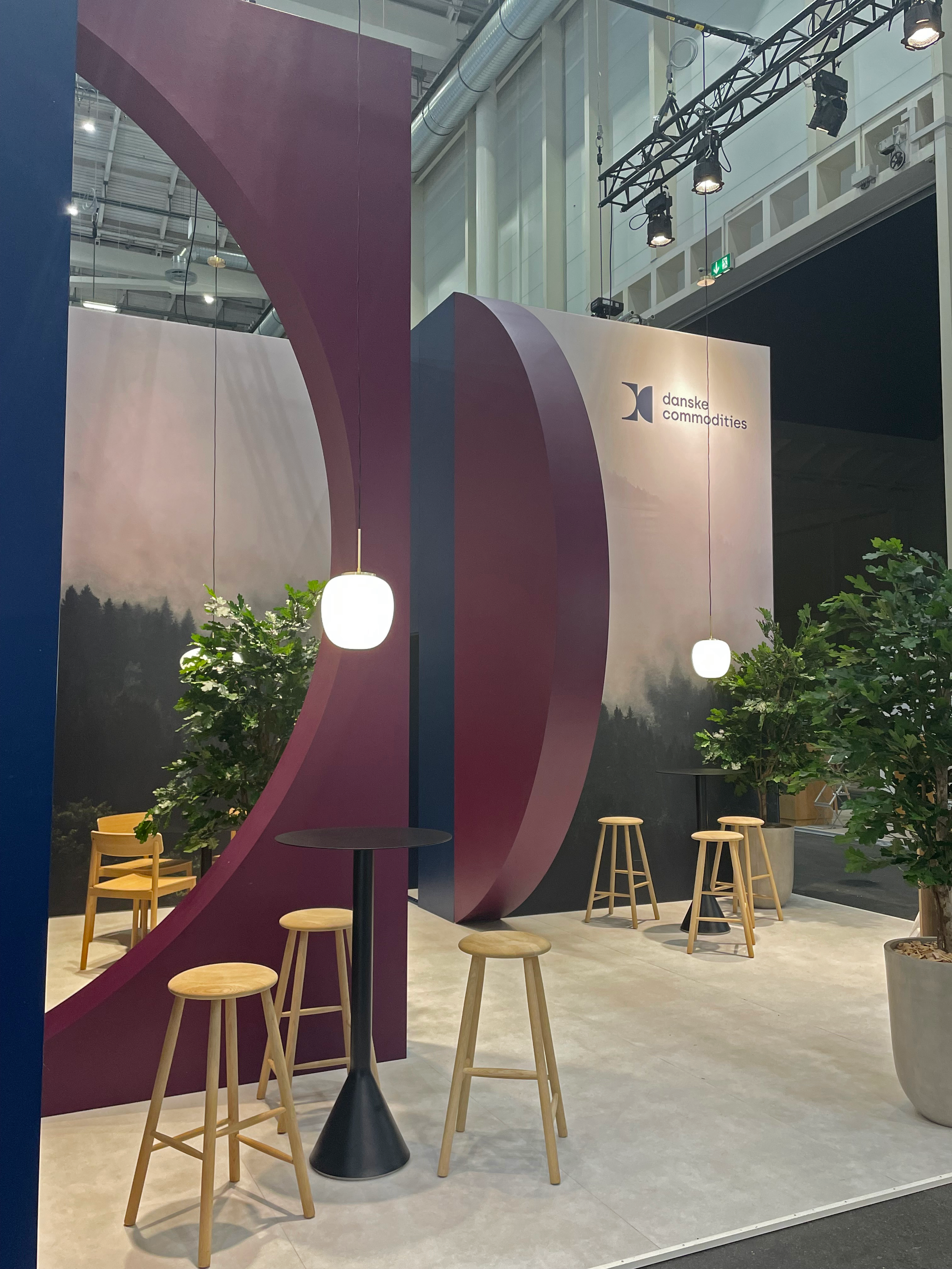
Innovative use of recognizable visual DNA
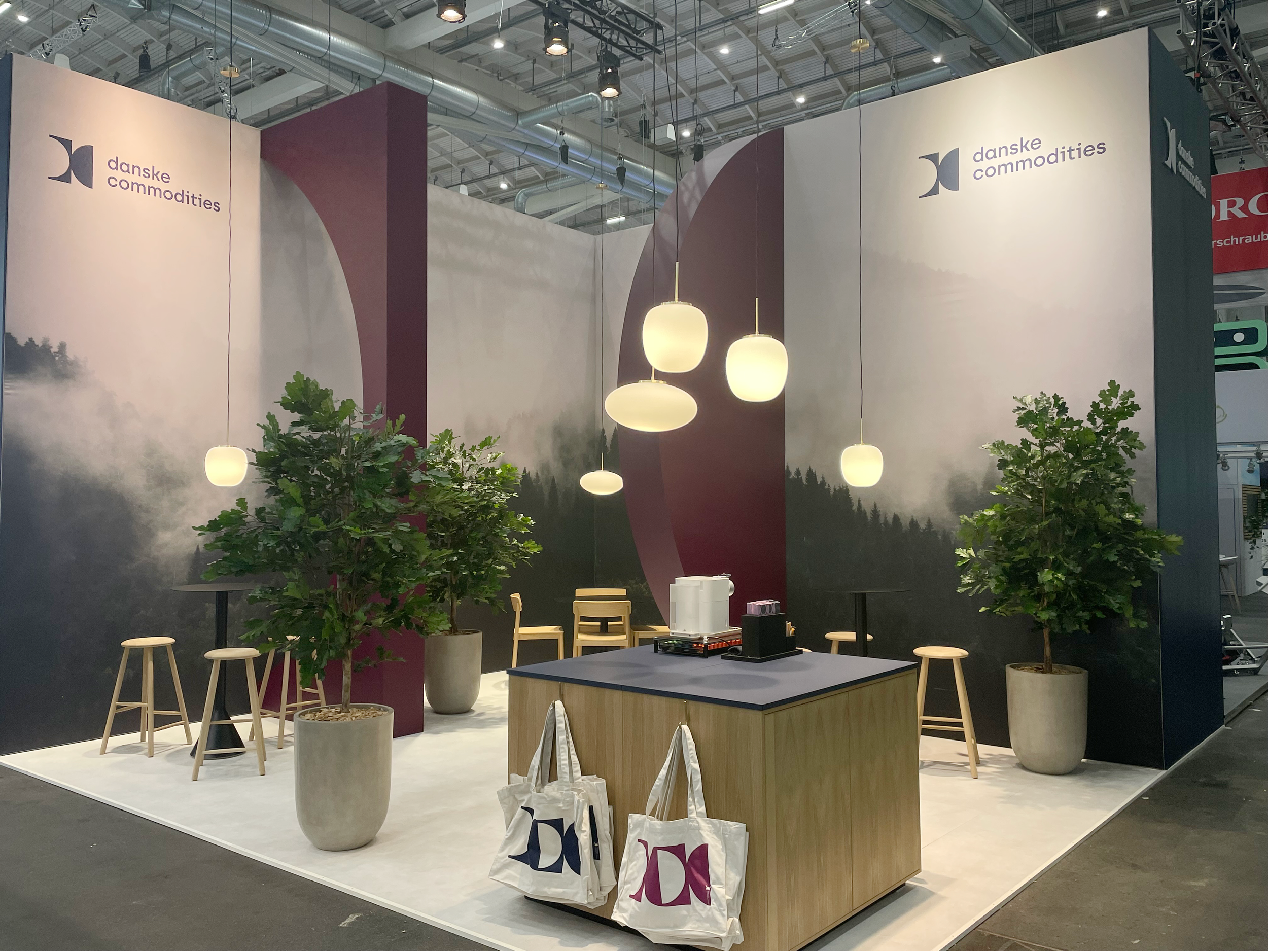
Ambiente has designed Danske Commodities' new exhibition concept, which creates visual interest and recognizability with an unconventional use of the company's visual identity.
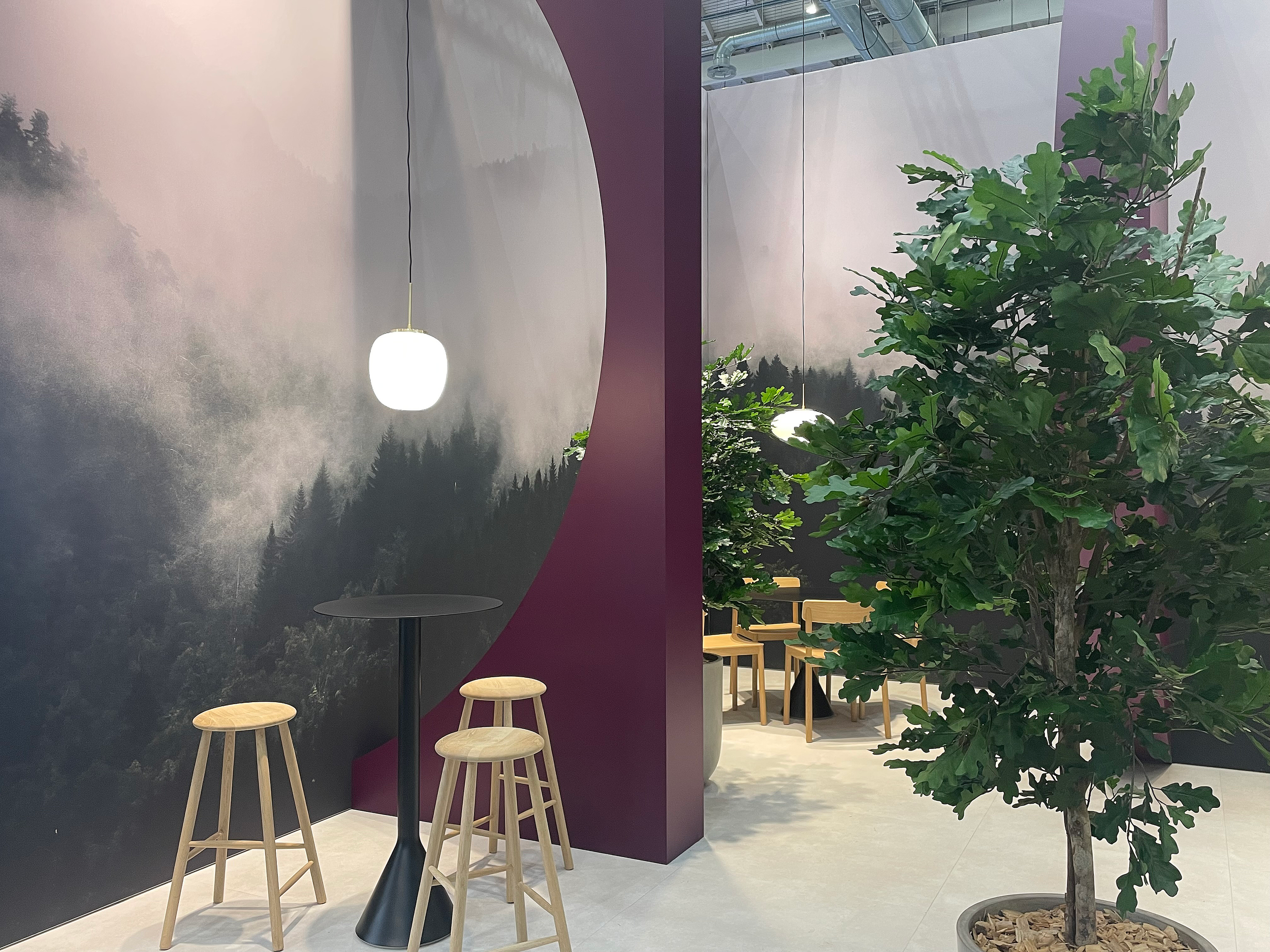
With a special focus on memorability, the logo is integrated as an active part of the exhibition stand's design and has a new function as a unique shielding of an intimate meeting area with the opportunity for deeper dialog. The surrounding square meters encourage shorter conversations over strategically placed high tables, where a custom-made coffee counter in oak veneer forms the centerpiece.
The eye-catching brand colors form the foundation for a contrasting design that uses plants and wood to create a warm and comfortable look. To support the welcoming exhibition design, the stand is also decorated with organically shaped pendants that softly illuminate the stand.
Storage room hidden away by illusion
To ensure a consistent design, we also made sure to hide the stand's storage room by using one large brand image on the 4.5 meter high back walls. This illusion ensures that the focus of the exhibition concept is not disturbed by an element whose primary purpose is practical.